
 Learn About Weather with Our Tutorials
Forecast
Model
Lightning
Meteorology 101
If you click on Forecast, the very first option is U.S. Current Temperatures. Have you ever wondered where those temperatures come from? Those temps come from METAR sites, which is basically a fancy way of saying that they come from airports. A METAR is a Meteorological Terminal Air Report. By the way, meteorology is famous for acronyms! (ha)
METARs are reports that pilots make good use of. I'll have more on METARs when we get to the aviation stuff under the aviation tab. Just an FYI, the correct way to take temperature is within a white box, protected by wind but with sufficient ventilation, about 4 feet off the ground. I have a picture below of one. This is a typical METAR temperature-taking device.
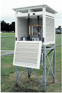
Notice I said it has to be four feet off the ground. This is why we can get frost when the temp is in the mid 30s. On clear, calm nights the ground cools off faster than the air above it. It has to be 32 degrees for water to freeze. The air right at the ground may be 32, while the air four feet above is 35 degrees.
The EarthCast global model is run twice a day (7:00a.m / 7:00p.m.), producing a 36-hour forecast. It is a full Earth System Model, which means it takes into account the atmosphere, land, and oceans and not just the atmosphere alone. The model is run with cloud-resolving physics, something that no one else is doing.
The model goes out to 36 hours from the run time. You can select if you want just satellite, just radar, or a combination of the two. The farther in time one goes out from the model run, the less accurate the model is liable to be. For instance, if the model is run at 7:00 a.m. it will be most reliable within the first few hours after 7:00, and much less so by the afternoon.
At the bottom left-hand corner of the model image you'll see a valid time. That is the time the model is depicting. Below that you'll see a Model Run time, which is the time the model was run. The model cannot tell you exactly where precipitation will fall, but if you see blotches of green across your area, you know that the model is predicting scattered precipitation, some of which could fall on your area of concern.
That's your basic run-down of predictive radar and satellite! Let me know if you have any questions!
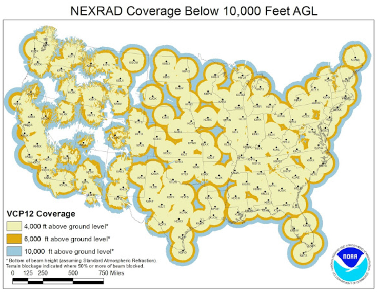
Have you ever wondered what a mosaic is? That's just simply the combination of the data of multiple radars. It makes it look like the country is covered by one giant radar, when it fact it's covered by 159 NEXRAD radars. (Remember, the TDWR radars only cover the airports and the area closest to them.)
Once on the map, you can click on it to zoom in. The first map is national, the second regional, and the most zoomed-in one is state-level radar, which also outlines the counties. Radar basically sends out a signal. If that signal strikes something (ie. Rain drop, hailstone) it returns to the radar. The radar receiver detects this return and uses that information to determine how large the struck object was. For instance, if the radar strikes a hailstone, the radar return will be much stronger (show up brighter on your radar) than if the radar hit a raindrop (that would show up as a lighter color on your radar).
Radar sites can only be found near National Weather Service offices. This can mean that some areas have very poor coverage. Notice the gaps in coverage on the map below.
Complete radar scans are done every 4.5 to 10 minutes, depending on the setting. If there's nothing going on, it will be set to scan every 10 minutes. Notice that even on its best day it scans every 4.5 minutes. This is why some chasers get caught off guard. A LOT can happen in 4.5 minutes.
So, is there level I data? Yes! Level one is the raw data that comes straight from the radar with no quality control done to it. It's a mess!
Level II is much different. With this data, each pixel size is the same, no matter how far away from the radar it is. This is also called super resolution data. Data has been filtered to get rid of buildings, mountains, and other obstructions that are always there. This data can be "smoothed" to look better to users.
Level III is even more processed but you only get 4 scans of a storm. These four scans are of the lowest levels of the storm. Now, while there are fewer scans with level III, you get a LOT of information from these few scans. You get your precip estimates, vertically integrated liquid, TVS signatures, mesocyclones, hail indicators, storm relative velocity, etc etc from just these four, data-heavy, scans. You may notice some of these products on RadarLab HD+, but we'll talk about them in more detail when we get to that point.
That is all for now! We'll talk about echo tops next time.
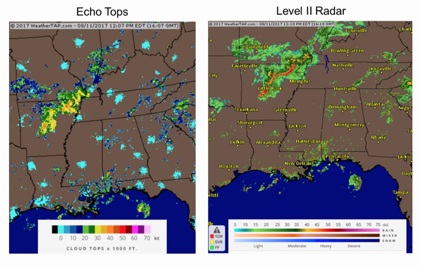
Echo tops is a radar product offered by weatherTAP that gives you some valuable information on a storm's vertical development. Always keep in mind that echo tops do not tell you how tall a t-storm is. Many people have that misconception.
Echo tops tell you the top of an area of precipitation, as detected by radar. It is the highest level of a storm that the radar detects "bounce-back" energy of at least 16 dbz. Radar measures energy in dbz units. That's the measure of the amount of energy that returns to the radar after it is bounced back, whether from hitting a rain droplet, hail stone, snowflake, etc. Light rain returns a signal of about 16 dbz. The radar really cannot detect anything less than that. So, radar will tell us that the highest cloud top is, say, 35,000 feet because at 35,000 feet it detected a "16-dbz's" worth of precipitation. However, the cloud will go even higher than that because the radar can't detect the mist that makes up the cloud (clouds would return a dbz much lower than 16 dbz).
We can get a lot of information from echo tops by knowing the highest altitude that radar estimates precipitation to be. Generally, the higher the echo tops, the stronger the storm. This is due to the fact that stronger updrafts should lead to precipitation being hoisted higher into the atmosphere. We'll talk more about dbz a bit later on, especially when we get to RadarLab HD+ material.
Below is an example of how I have used the echo top product this morning. I'm focused on that line of storms approaching the Mississippi River. Notice how the echo tops correspond to some of the heaviest rainfall? We can use the echo tops product and feel confident that cloud tops are exceeding 40,000 feet, giving us an indication that these storms are strong enough to produce very heavy rainfall, strong winds, and dangerous lightning. It's always helpful to be able to utilize more than one product to determine a storm's strength. That helps cut down on false-alarm warnings. Basically, the radar product shows us what kind of precipitation we can expect near the surface, while the echo tops product shows how high up the radar detects precipitation.
Next week we'll talk about the lightning data product!
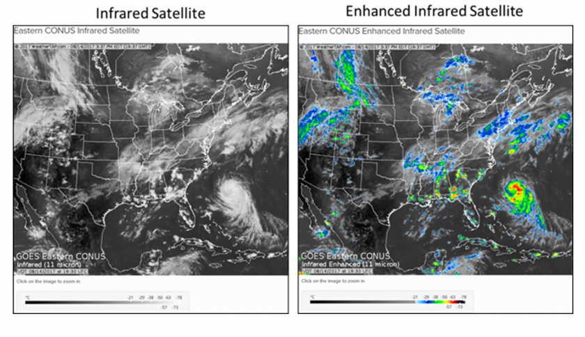
You may have seen weatherTAP's satellite products and wondered what the difference was between the satellite products. Today, we'll talk a little bit about IR and visible satellite imagery. The next product on our list is the radar/satellite overlay under the "Forecast" tab. This particular overlay alternates between using IR and visible satellite. The visible is used by this product during daylight, and IR is used at night, though IR can be used during day or night.
The IR sensor detects the amount of thermal (heat) radiation being emitted into space from the earth and its atmosphere. All objects radiate IR light because all objects radiate some type of thermal energy. IR satellite sensors can detect the temperature of an object by the character of the IR light it emits. The warmer the temperature, the grayer it appears on satellite. The colder the temperature, the whiter something appears on the satellite image. So, clouds should appear whiter than the surface, since they're colder. Some problems from IR satellite imagery include clouds that are really low to the ground and nearly the same temperature as the ground (ie fog). The low clouds will show up as nearly the same color grey as the ground and are very difficult to see. IR satellite works any time, day or night, which is helpful in tracking storm systems at night.
IR's counterpart, visible satellite, is only useful during the daytime, because it relies on sunlight reflected up to the satellite. Visible satellite has a much better resolution than IR and can be used to detect smoke, fronts, and other subtle surface boundaries.
You may have also noticed on some IR satellites that the highest clouds tops were in various shades of yellows and reds. That's called enhanced IR satellite. That is simply an algorithm developed to determine which cloud tops are the absolute coldest, since a regular IR satellite image only shows shades of grays and whites. Since colder cloud tops typically indicated stronger storms, this can be useful in identifying storm intensity. The colder cloud tops are colored red, while the warmer cloud tops are greys and blues. Notice how much better the colder cloud tops show up on the hurricane in the enhanced IR image.
Next time, we'll talk more about what GOES East and West satellites are and how GOES-16 is going to forever change satellite science.
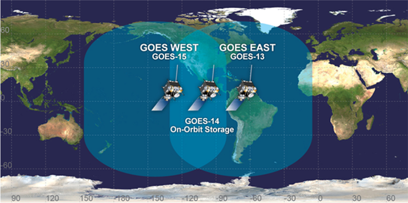
The next choice we have on our list is GOES East or GOES West visible satellite. We've already talked about the difference between visible and infrared satellite, but what exactly is GOES?
First of all, GOES stands for Geostationary Operational Environmental Satellite. The satellite is a joint effort between NOAA and NASA that began in 1966. GOES's operational lifetime extends through December of 2036. There are two GOES satellites, one positioned at 75 degrees west longitude (GOES-East) and the other at 135 degrees west longitude (GOES-West) (see pic below). There is also one in the middle for backup, just in case something happens to one of the other two satellites.
As the name implies, these satellites are fixed at certain points above the earth, so we get a continuous picture of the earth below them. And, of course, GOES East gives you a view of the eastern side of North America, while GOES West gives you a view of the western side of North America.
Now, we have GOES-16. GOES-16 is providing incredible images of storms faster than any other satellite data we've ever known. GOES-16 can scan in 15 minute, 5 minute, or 30-60 second intervals, all at the same time! This allows for incredible evaluation of storms in real-time. The satellite also has 4 times greater resolution, while being five times faster than ever. In addition, hurricane tracking, warning lead-times for severe thunderstorms, lightning detection, and solar flare warnings will all be improved with the addition of GOES-16. The addition of GOES-16 will allow us to see the weather like never before. GOES-16 will take the place of GOES East, while another launched satellite will take the place of GOES West next year (2018).
Your next weatherTAP option is national lightning, where you can actually view where lightning strikes have occurred. A legend below the screen tells you how old the strike is, with white being the most recent. You can choose to just watch lightning strikes or you can add either infrared satellite or visible satellite to the image.
I should note that there is already a tutorial in place for this lightning data. Just select "tutorial" on the National Lightning screen and you'll get a good review of how the lightning data is gathered and much more!
Lightning can give you a good idea of how robust or severe a t-storm is. All thunderstorms produce lightning. In fact, lightning is what makes a storm a storm! Without lightning it just isn't a storm.
So how does lightning even form? Well, we do know that lightning results from a difference in charges. The greater the difference between positive and negative charges, the greater the chance for a lightning strike. We also know that water carries a negative charge and ice carries a positive charge. The bottom of a cloud is mostly liquid, heated in part by rising air that feeds into the updraft that actually builds the cloud in the first place. As we go higher and higher, the air gets colder and ice crystals are allowed to form. This creates difference of negative charges at the base of the cloud, and positive charges at the top of the cloud. Nature doesn't like imbalance, so when this imbalance gets too great.....BOOM... a lightning strike. As soon as that strike takes place, the charges balance out. As soon as the strike is over, the charge differences start building up again. How soon those charges imbalance again determines how long it is until your next strike.
Now, it's rather easy for lightning to travel through that cloud. After all, it's made up of water droplets that conduct electricity rather well. That is why you don't put electrical things in the water! This is one reason why we think there are at least five times more intracloud strikes than cloud-to-ground (CG) strikes. In order for a strike to travel from a cloud to the ground, it has to make it through the air that is in between. Air is not a good conductor of electricity. So, the charge imbalance has to really build up before the strike can happen.
Increased lightning activity can indicate a storm that is intensifying. Some studies have found that a sudden increase in lightning can indicate a developing tornado. The most important thing is to make sure you don't find yourself on the other end of lightning's strike! If you're close enough to hear it thunder, you're close enough to be struck.
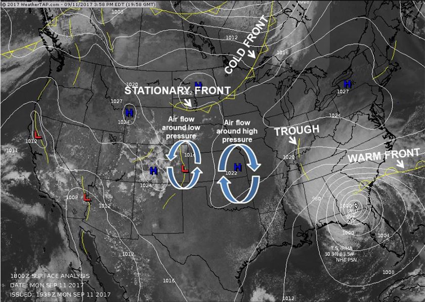
Being able to analyze a surface map is crucial to understanding the weather. I have attached a recent surface map to help you follow along. You'll immediately notice the blue 'H's and red 'L's. These are high and low pressure areas, respectively. Air rises in low pressure. Since temperatures decreases with height, this rising air cools and condenses into clouds, thus, the weather around low pressure is cloudy/stormy. Air sinks in high pressure. Sinking air compresses, warms and dries out. Therefore, the weather around high pressure is often cloudless.
In addition, air blows toward low pressure (convergence) and away from high pressure (divergence). Air also circulates counterclockwise around low pressure and clockwise around high pressure. Since each L or H describes the center of the lowest or highest pressure, you can tell which way the wind is blowing by knowing where these centers are located.
Also, wind always blows from high to low pressure. In fact, wind is the direct result of pressure imbalances. Wind is nature's way of balancing the pressure fields. The more imbalanced pressure becomes between two areas, the stronger the winds will be between these two areas. For example, the air pressure inside a tornado is really, really low. That makes the pressure incredibly imbalanced between the location of the tornado (low pressure) and locations surrounding the storm, creating severe winds that work to try to balance the pressure differences.
The white lines you see on the map are called isobars. These are lines of equal pressure, connecting places that have the same pressure readings. The closer the lines are to each, the more quickly pressure changes with distance. This pressure imbalance will cause stronger winds. Notice the isobars are so close to each other across the Southeast. This is Tropical Storm Irma on September 11, 2017. Sustained winds at the time of this image were 60 mph.
I should also take a minute to explain pressure. Pressure is measured by the weight of the atmosphere pressing down on an object. If the air is rising (low pressure) the weight of the atmosphere is less. If the air is allowed to sink (high pressure), the weight of the atmosphere would be greater, and you'll have higher pressure readings.
There are several ways to get air to rise. Mountains are one way. When wind encounters a mountain it has two options. It can either go around the mountain or up and over the mountain. When it goes up and over the mountain the air is forced to rise.
Fronts do the same thing. When air converges at a front it is forced to rise. Fronts represent the boundaries between different air masses with different temperature and moisture characteristics.
Air rises quicker along cold fronts, so you often see your stormiest weather along them. They are the line with the triangles. The triangles point in the direction the front is moving. There is one stretching from Canada into Minnesota on the map. If it is moving at less than 5 mph, it is called a stationary front. A stationary front has triangles and half circles alternating along it. You can see one stretched across South Dakota on the map. Air rises more gently along a warm front. This usually leads to more widespread, gentle rainfall. Warm fronts are the lines with half circles along them. The half circles point in the direction the front is moving. There is one extending eastward from Irma on the map. You'll also notice the dashed lines. These are areas of lower pressure that we call troughs. They're basically weak disturbances that don't have a great enough temperature or moisture difference around them to be a front, but they do represent an area of lower pressure.
During the warm season months, you may notice a dry line front moving across Texas and Oklahoma. These fronts separate dry, desert air to the west from warm, moist air in the east. These fronts move from west to east through the day and can cause severe thunderstorms. The front is drawn like a warm front, with the half circles pointing in the direction of movement, but unlike a warm front, the half circles touch each other all along the front.
Also, on this map you see the L for low pressure over the California/Arizona border. That represents a thermal (heat) low in that desert area. Warm air rises and air in the Desert Southwest gets REALLY warm. That rising air creates a flow of moisture that will move in from the Pacific and the Gulf of California, leading to rainfall. We call this the monsoon, which is just a seasonal pattern of wind that develops.
Anytime air converges, or comes together, it is forced to rise. As air comes across the Pacific Ocean it doesn't encounter anything to slow it down until it reaches the West Coast of the US. Then, the friction of the land slows that wind down and causes air to converge along the coast. Since converging air must rise, an area of low pressure forms along the coastline. This can also lead to rain showers.
Hopefully, this has been a good crash course in basic weather map reading!
Under the "Forecast" tab you'll see an option for "U.S. Current Temperatures". These temperatures are reported primarily by airports that have sophisticated temperature-measuring equipment. Temperature is technically the measurement of molecular activity in the air. The standard height for a thermometer is about four feet off the ground.
It is important that you know that temperatures are taken four feet off the ground in order to understand frost. You may have noticed forecasts like this, "Expect clear skies and calm winds tonight. Temperatures will drop into the middle 30s, so expect areas of frost to develop after midnight."
If water freezes at 32 degrees how can you get frost if the temperature is above freezing? I'll try to explain. On a clear, calm night the heat radiates from the earth's surface very efficiently. The ground cools very quickly and, thus, cools the air in contact with it very quickly. Air is heated by longwave radiation from the ground. The ground is heated by shortwave radiation from the sun. So, the sun doesn't heat the air because the air is heated by the ground. Air cannot efficiently absorb the shortwaves from the sun, but it can efficiently absorb the longwave radiation emitted by the ground.
Since the ground cools more quickly than air, the air in contact with the ground ends up being much colder than the air up off the ground. This is called an inversion, when temps get warmer farther up from the ground. This means that by the time the air gets to your thermometer, which is four feet off the ground, the temp is closer to 35 or 36 degrees. You must have calm winds because wind will mix all the air up and prevent frost from forming on the ground. Clouds will prevent heat from radiating away from the earth efficiently, as they will act as a blanket and radiate the heat back to earth, therefore it must be a clear night.
Other terminology you may hear with respect to temperature involves averages. You may hear your local weather forecaster say that the temperature is below average, average, or above average. Averages are calculated based on the 30-year average high/low temperature for that day. If you take all the high temperatures that have occurred on this day over the past 30 years and that equals 65, and today's high is 67, today's high is two degrees above the average high for the day. Sometimes the word "normal" is substituted for the word "average."
Surface temperatures can tell us a lot about the atmosphere. For instance, warmer temps can mean more available energy for storms. Temperatures that are around freezing (32℉) can tell us what the risk is for ice and snow. Temperatures can also tell us where fronts are located. If the temperatures in Kentucky are in the 70s, for example, and the temperatures in Missouri are in the 40s, we can be very confident that there is a cold front between Missouri and Kentucky. We can study how temperatures change across the landscapes to identify many different types of fronts. This is helpful since fronts tend to produce precipitation.
Next week, we'll explore predictive radar and how that works!
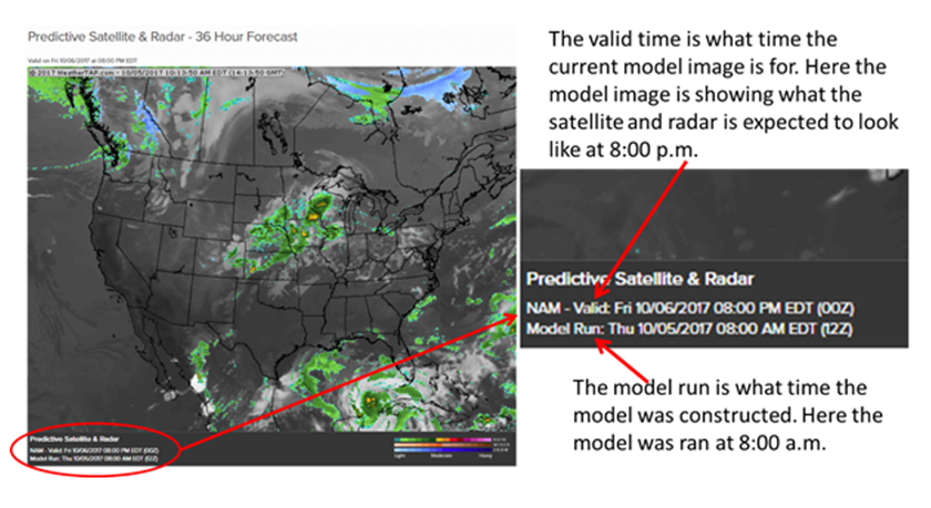
This is the second time we have come upon the predictive satellite and radar product, but it's worth a revisit. Predictive Satellite and Radar is a product offered by weatherTAP that lets you see the precipitation and cloud cover that the North American Model (NAM). The forecast extends out to 36 hours from the time of the model run. The model run images are in 3-hour time steps.
You can always tell what time the model data was constructed by looking in the lower left corner of the image. The run time and the period of time the model is valid are both shown here. Here is an example:
The NAM model is a major weather model used for short-term weather forecasting.
With this weatherTAP product you can always choose to turn off the satellite or the radar by unchecking those options on the left hand side of your screen.
Revisiting predictive satellite and radar is a good stepping stone into what we'll be discussion next week, the model data page offered by weatherTAP. Don't worry, we'll take things in baby steps. Model can be difficult to explain and interpret but I think you'll understand it a lot better after our model lessons! As always, if you have any questions at all just let me know!
Now, we venture to the next tab over on the homepage to model data. Now, model data can seem intimidating, but it's really not that complicated. I will walk us through it in baby steps and by the end of the model lessons, you should have a good grasp on what model data is, where model data comes from, and how to interpret model data. ALWAYS, keep in mind that model data is not a substitution for an official forecast. Sometimes, even folks trained in meteorology rely all too heavily on the models and neglect to implement their meteorological training that should ALWAYS accompany the model data. The computers simply produce a forecast based only on numbers that are fed into them.
The data for the models is derived, at least in part, from weather balloon launches (radiosondes). Weather balloons are released twice a day at the same time around the country (7:00 a.m and 7:00 p.m). In the winter time it's 6:00 a.m. and p.m. due to daylight saving time. The balloon launches sample the atmosphere from the surface to over 30,000 feet up! They record temperature, pressure, and moisture as they ascend and radio back that info to the National Weather Service. Models can also take into consideration surface data that is fed into them from various, reliable weather stations across the country. The more data that can be fed into the computer, the more accurate the output forecast will be.
The first model that we come to is the RAP model. RAP is short for rapid, because this is a rapid refresh model. That means it updates rapidly compared to other models. In fact, this model updates hourly. It has a 13-km resolution. This model is practically a cousin to the HRRR (high-resolution rapid refresh) model that many of you have probably heard of. The main difference between the two is that the HRRR has a much higher resolution model at 3-km.
So, basically the RAP is a model that updates hourly and has a 13-km resolution (13-km~8 miles).
All of weatherTAP's model data has the same basic categories for choices, with some minor variations in options under these choices. Those choices are:
- Wind and height
- Temperature
- Relative humidity
- Dewpoint
- Severe indices
- Precipitation
The first option, wind and height, are important for understanding how wind changes with altitude. We'll dive into how to read this very important map next week!
In meteorology we study altitude by pressure level (millibars), and each pressure level has an average height to it. Here on the surface of the Earth, we have an average pressure of about 1000 millibars (mb). If you go up to about 18,000 feet, you can find a pressure reading of about 500 mb. That varies slightly every day but I'll explain that later. I use 500-mb as an example because that is the level that we consider to be the middle of the atmosphere (half of the 1000 mb surface reading). Here are other pressures and their associated altitudes:
- Surface
- 5,000 feet
- 10,000 feet
- 18,000 feet
- 30,000 feet
- 35,000
- 40,000
- 45,000
- 925-1000 mb
- 850 mb
- 700 mb
- 500 mb
- 300 mb
- 250 mb
- 200 mb
- 175 mb
- Influenced by friction of Earth's surface
- Lowest level that friction is not heavily impacting
- Look for "cap" here (I'll explain later)
- Mid-level of the atmosphere
- Level of polar jet stream
I highlighted the levels we are most concerned with.
As meteorologists, we divide the atmosphere into these different layers and analyze what is going on at each layer. That's necessary in order to understand how to make a forecast for each day.
We must understand the wind at various altitudes in order to even begin to forecast the weather. We need to know how fast a system is traveling, how likely the winds are to continue carrying the systems, and in what direction we can expect that system to move. If air rises, that can lead to precipitation. Remember, earlier we've talked about how rising air cools and condenses and can form clouds and precipitation. Air can be rising at one level but not at another. We need to understand all that in order to make an accurate forecast.
Now, when you click on, for example, the "850-mb wind and height" for the RAP model you should know that you have selected the rapid refresh model (RAP) and you are analyzing what the model is forecasting at the 850-mb level, or at about 5,000 feet up. You can choose to let the page display wind by coloring in the wind speeds for easy viewing, or by showing wind barbs, which show wind direction/speed (see https://goo.gl/jL6fKp). The lines you see are showing you the height of the 500-mb level. Add a zero to the end of the three-digit number and you get the height, in meters, of where you would find a pressure of 500-mb. Again, on average that height is about 5,000 feet up, but it varies slightly. Those slight variations tell us a lot about the weather. We'll learn about that next time!
The next option with model data after wind/height is severe indices. Before I dive too much into these, I would like to explain why the 500-mb height level can rise and fall, if even slightly. When mb levels rise, that signifies warming. For example, if south winds begin to blow here at the surface, transporting in warmer air, the 850-mb level (at 5,000 feet) will rise slightly in elevation. It's like the atmosphere swells as it warms. So, when we see mb levels rise, we know warming is taking place below that level.
Warming can take place at different levels. For instance, if we have a cold air mass in place but a warm front from the Gulf starts lifting northward, that warm (and much lighter) air will move up and over the cold air that is at the surface. That can create a layer of warmer air on top of a layer of cold air that is trapped here at the surface. That is how we get ice storms, when rain in the warm layer falls into the cold layer here at the ground.
You'll notice that the option for surface wind and mean sea level pressure is also available to analyze. It is crucial that we know where the surface low pressure center is located. Severe thunderstorms are most likely to the east (and especially southeast) of the surface low, where the greater amounts of warm, moist air are located. Wintry precipitation is more common north and west of the low center, where cold air is most likely to be. Knowing the tracks of lows is crucial for knowing what kind of weather you are most likely to have, whether it be rain, storms, ice, or snow.
Now, the severe indices may mean nothing to you at this point. That is about to change! The first one we come to is CAPE. That stands for convective available potential energy. Whew! That's a mouthful, right? Without bogging you down with too many details, CAPE is basically the amount of energy that is available for thunderstorms. Generally, you need at least 1000 J/kg of CAPE for severe weather, though CAPE as low as 500 J/kg can give you storms, especially in the winter time. I usually don't get too excited about severe wx possibilities if CAPE is under 1,000 J/kg. The amount of energy present can tell us how strong updrafts will be. The stronger the updraft, the stronger the storm.
CAPE is probably one of the most widely used severe indices there are. We can know a lot about the environment by knowing how much energy is within the environment. Energy basically comes from heat and moisture. The more of each you have, the more powerful storms can become. Think about how powerful hurricanes become. All they have fueling them is hot, moist air.
We'll learn about some of the other severe weather indices next time!
The next two severe indices that we come to are CIN and Lifted Index. CIN is Convective Inhibition. CIN basically calculates the amount of negative buoyancy that is present. In other words, it measures the amount of energy that would discourage air from rising. Air that rises forms clouds, so if air isn't rising clouds are not forming. On the weatherTAP scale, you don't need to pay attention to the numbers as much as you do the colors. The bluer colors indicate low CIN, while the redder colors indicate higher CIN. The higher CIN, the less likely we are to see severe weather.
The next indice is Lifted Index. To better understand this index, you need to understand that in meteorology we have what we call air "parcels". Imagine you are out in the middle of a big parking lot in the middle of the summer. It's really, really hot. So, "bubbles" (or parcels) of hot air will rise from the parking lot like balloons. In meteorology, we imagine that these parcels of air stay in a bubble as they rise (like air in a balloon). As long as the air around the balloon is cooler than the air within the balloon, the balloon will continue to rise (warm air rises, right?). Now, the difference in temperature between the air in the balloon and the air outside of the balloon is called the Lifted Index. The greater the temperature difference, the faster the balloon will rise. So, on your Lifted Index model, the greener colors represent a slowly rising balloon, while the brighter colors represent a faster rising one. The faster the air rises, the more likely you are to get thunderstorms.
You may notice that weatherTAP offers two Lifted Index products. One is surface based and the other is called Best Lifted Index. The Surface Lifted Index is best used when gauging a severe weather risk because it takes the parcel (balloon) from the surface up to about 18,000 feet (500mb level). In other words, the temperature of the parcel at the surface is compared to the temperature of the parcel after it is lifted 18,000 feet. The greater the difference between the two temperatures, the more unstable the atmosphere is.
The Best Lifted Index measures the difference in temperature between the air inside and outside of the balloon at various heights from the surface to 850 mb (5,000 feet). This is most useful when there's a shallow layer of cold, stable air at the surface but warmer, more unstable air above that layer. This can happen quite easily when warm fronts are moving in and the colder, heavier air is reluctant to leave, while the warmer, lighter air glides up and over the top of it. Sometimes the warmer air above the colder air can become unstable enough to produce thunderstorms. That's where the Best Lifted Index comes in handy! In other words, unlike the Surface Lifted Index, the temperature of the parcel at 18,000 feet is compared with various levels from the surface up to 5,000 feet and not just from the surface alone.
Well, that's your lesson for this week! I know we've covered a lot with these severe indices but you'll be a better junior meteorologist for knowing this! The hardest part is over and now we'll be getting into some easier stuff. As always, let me know if you have any questions!
Temperature is a measure of energy available in the atmosphere. Just think about how intense summer thunderstorms can be when it is so incredibly hot outside. The storms have so much heat energy to work with, so they become quite strong. The same is true with hurricanes, forming and spinning in the hottest tropical regions of the world. So, yes, it is a fact that temperatures here on the surface are important, but it's also very true that we need to know what temperatures are doing as we go up into the atmosphere.
The faster temperature decreases with height, the more unstable we consider the atmosphere. Warm air rises and the faster it rises the stronger the updrafts will be in the clouds. This is why summer storms get so intense. The hotter the temperature is here at the ground, the faster temps will decrease with height, leading to air that rises more quickly. The rising air lead to stronger updrafts. The stronger the updrafts are the stronger the storms will be. We call the rate at with temperature decreases with height the "lapse rate". Lapse rates are important to know anytime precipitation is expected to occur. A parcel of air can only rise if the air around it is cooler than itself (again, warm air rises).
WeatherTAP's model data allows you to see what the temperature is expected to be at various heights in the atmosphere. We start at the surface and work our way up. You may see that the models are forecasting surface temperatures in the 70s for your area. However, when you look at the 500-mb map (18,000 feet up) you notice a very cold pocket of air (purple colors) expected over your location at the same time you are expecting surface temps in the 70s. This means you have steep lapse rates and may be looking at some rainfall or thunderstorms in your area. Cold air over the top of warmer air encourages rising motion because lapse rates become steeper, which encourages clouds and precipitation. I should note that temperatures generally decrease with height every day, but when we either make that cold air colder or make the surface air warmer, we cause the difference to be even greater than it is on a "normal" day, which is when we get clouds and rainfall.
You'll also notice that you can add wind data to the maps, which allows you to see the speed at which the different air masses with different temperatures are moving. It also helps to see the direction that they're moving. You can also see the isobar lines, lines of equal pressure. The closer these lines are to each other the faster the winds are moving (more on isobars later on).
Yes, temperature is certainly very important weather data information but there's another factor that is equally important. Next time, we'll talk about moisture and what weatherTAP's model data can tell us about that!
The first item we come to under the precipitation tab in model data is precipitable water. In the last lesson we talked about how important temperature data was. Equally important is moisture, because moisture is the fuel that drives the storms. Basically, warm air rises, as we discussed last time, and is the transportation for water vapor to get lofted into the atmosphere. Rising warm, dry air will not lead to cloud development (think desert). Warm, moist air rising has a good chance of forming clouds (think jungle). Since moisture is the fuel for storms, the higher moisture content in the air means a better chance of storms. Moisture is to storms what gasoline is to your car. In weather, the "octane" level of the fuel depends on the moisture content and the degree of warmness of the air transporting the moisture upward. In addition, the warmer the air is the more moisture it can hold. Again, the more moisture you have the more intense your rainfall or storms can be.
Precipitable water is important because it can give us an idea of how much moisture is available in the atmosphere. Precipitable water is calculated by taking a column of air from the ground up and condensing all the water vapor out of it. The liquid content that results from this is called your precipitable water. Just imagine standing outside and looking straight up. If all the moisture straight up above you were brought down to the ground, precipitable water is the amount of water you would be standing in. Higher precipitable water values indicate that there is a lot of available moisture in the atmosphere. Values over one inch are typically considered high, though that can change based on your geographic area (ie. desert vs coast).
It is important to remember that precipitable water does not determine how much it will rain. This is a rather common misconception. If the precipitable water value is 1.25" that does not mean it will rain 1.25". That's not to say it won't rain 1.25" but other factors can influence the final rainfall tally, including wind shear. For instance, if storms are moving northeast but the surface winds are blowing from the southeast, a constant and fresh supply of moisture-rich air being channeled into the storms. This can significantly enhance rainfall amounts and produce amounts that may far exceed the 1.25" found in the precipitable water calculation.
Next week we'll discuss the precipitation accumulation tool and how you can use that to get an idea of how much it's going to rain!
Since we're getting close to be finished with the gist of reading model data, I'm working on some projects that will test your ability to use model data to figure out what the weather might do! I think you'll really enjoy this!
The next selection after precipitable water is precipitation accumulation. Sounds pretty straightforward, right? The one thing you have to keep in mind is that the different models do this calculation in different time intervals. For instance, the RAP model does precipitation accumulation in one hour intervals, the NAM in three, and the GFS in six. In other words, if you are looking at the RAP model that is valid for 2:00 p.m., it will be showing you the precipitation it expects will have accumulated from 1:00 to 2:00 p.m. Just be sure you keep that in mind when analyzing the model data.
One of the nicer things about the RAP model being more short term is that it can also do precipitation rate. That can come in handy when you need to know the intensity that precipitation will fall. Our RAP model is the only model with this particular feature.
Composite reflectivity shows you were the model thinks there will be precipitation. Just use the scale at the bottom to see at what intensity the precipitation is expected to fall. Just keep in mind that this is a model and there may be certain factors the model is not considering, such as dry air at the surface that may keep precipitation from falling to the ground before evaporating. Only the RAP and NAM have this particular feature.
Well, that wraps up the precipitation model data! Next week I'll explain the significance of the relative humidity and wind features of our model data. The wind data gets us into talking about jet streams. With winds that can exceed 200 mph, you can bet they can have a very profound effect on the weather!
We've already talked a bit about the importance of moisture in weather forecasting. Moisture is the fuel for big storm systems. What you may notice with the model data is that we can look at relative humidity at multiple levels of the atmosphere. This is because, as I've mentioned before, the atmosphere has various levels to it and each one is important for making a weather forecast.
We all know how it feels outside before it rains or storms. It usually feels damp because you can feel the surface moisture that will eventually lead to precipitation falling from the sky. As we move up into the atmosphere, we must check the moisture at the various levels that we encounter. If we have moist here at the surface but we have dry air at a level above us, that can affect the precipitation that falls here at the surface.
If you recall, I shared with you the millibars and their relative elevations earlier.
- Surface
- 5,000 feet
- 10,000 feet
- 18,000 feet
- 30,000 feet
- 35,000
- 40,000
- 45,000
- 925-1000 mb
- 850 mb
- 700 mb
- 500 mb
- 300 mb
- 250 mb
- 200 mb
- 175 mb
- Influenced by friction of Earth's surface
- Lowest level that friction is not heavily impacting
- Look for "cap" here (I'll explain later)
- Mid-level of the atmosphere
- Level of polar jet stream
As meteorologist, we always look at the 700-mb level during severe weather times. Dry air at that level may "cap" the atmosphere. Imagine a clear, sunny day that is hot and humid. Normally, you see cumulus clouds go up. However, if there is dry air at the 700-mb level, the clouds can't go up. Heat and humidity continue to build here at the surface. It's like having a lid on a pot of boiling water. If something happens to cause the heat and humidity to suddenly be able to overcome the dry air at the 700-mb level, we say the cap breaks and thunderstorms explosively develop. It's like taking the lid off your pot of boiling water. The steam will punch upward! This is a dangerous scenario because you can go from clear skies to tornadic thunderstorms in minutes. You'll hear me talk about this more during severe weather season.
Dry or moist air at any level can affect the weather forecast, and we must be as familiar as we can be with the moisture conditions at each level. If we don't pay attention to each level of the atmosphere, we risk a busted forecast. And no one wants that!
Next time, we'll talk about the wind product that accompanies the relative humidity, so be sure and check that out!
In my opinion, wind is as important as moisture in weather forecasting. One thing to keep in mind is that wind is ALWAYS the result of an imbalance in pressure. Wind is nature's way of correcting a pressure imbalance. In fact, the very reason we have weather is because things get imbalanced on this planet. Nature is constantly working to keep everything in balance. The more out of balance things become, the harder nature has to work to bring back equilibrium. I always used to tell my students that, in Nature's eyes, it's too cold at the Poles and too hot at the Equator. Nature is constantly trying to balance that difference out and she uses weather to try and accomplish that goal.
Since temperature and pressure are directly related, one might also say that wind corrects imbalances in temperature. So, before moving forward let me give you a quick lesson on pressure.
Pressure is the force put upon you (or anything else) by the atmosphere. It's a measure of how much the atmosphere is pushing down on your shoulders. When the pressure is high, air is sinking. Think about it this way, in life we sometimes say we feel like we have the weight of the world on our shoulders. In meteorology we would say you have high pressure. You feel like you have the weight of the whole atmosphere pushing down on your shoulders.
High pressure = atmosphere pushing down (sinking air).
On the other hand, when air is rising we have low pressure. The air is rising and therefore you have less of the atmosphere pushing down on your shoulders. You literally weigh less when the pressure is low. Rising air leads to cloud development and stormy weather.
Low pressure = rising air and less atmosphere pushing down
Also, remember that wind always blows from high to low pressure. If I'm outside and the wind is hitting my face I can know that I'm facing the higher pressure and the low pressure is behind me. Wind always blows from high to low.
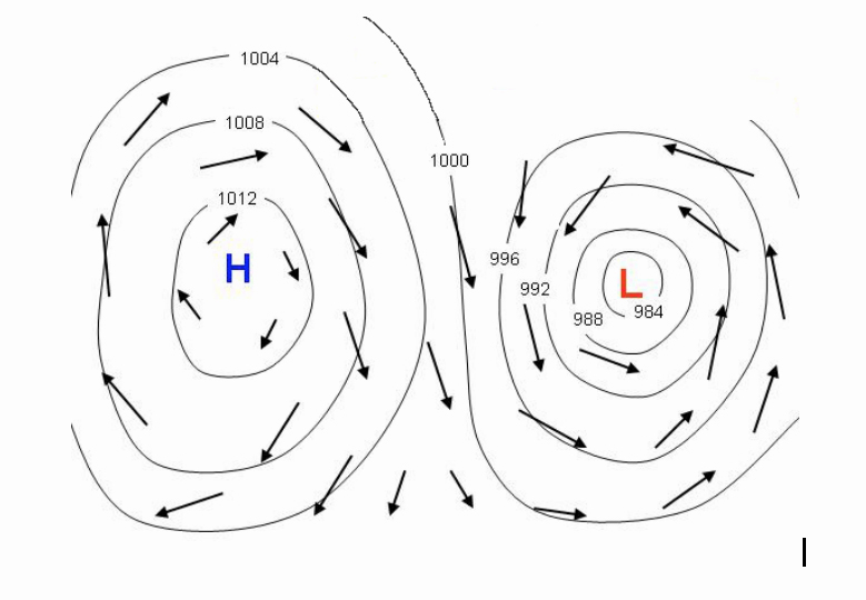
Another thing to keep in mind is that high pressure rotates clockwise and low pressure rotates counterclockwise. Please see map below:
As with all meteorology data, we have to analyze the wind from the surface to at least 30,000 feet up. We divide the atmosphere into several layers, as we've discussed before, and we must know what the wind is doing at each layer before making a forecast we can have confidence in.
In the next lesson we'll talk about how wind is represented in the model. In other words, I'll show you how to read a wind barb. I'll also talk about something called jet streaks, which play an absolutely critical role in our weather and can make or break a severe weather forecast!
In order to make an accurate forecast, there must be a good understanding of the wind throughout the atmosphere. We must not only understand what is occurring here at the surface, but we must also understand how the wind is behaving throughout various levels of the atmosphere.
Wind data tells us if storms will be able to organize and whether or not the threat from storms is large hail, tornadoes, flooding or any combination of these. We judge the volatility of an environment, in part, based on wind shear. There are two kinds of wind shear; directional shear and speed shear. Directional wind shear is the change in wind direction with height. Speed shear is the change of wind speed with height.
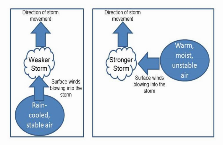
Shear is important for storm strength. If a storm is moving north and the surface winds are blowing into the storm from the east, those surface winds are supplying warm, moist air to the storm and it can continue to grow and intensify. If, on the other hand, the storm is moving north and the surface winds are blowing from the south, rain-cooled air from the storm will be blown right back into the storm, causing it to be weaker than it would otherwise be.
Shear can also give a storm?s updraft a rotational component. If winds are changing direction and speed with height, the storm's updraft will be able to rotate. This could lead to tornadoes.
If the jet stream is over the top of your location, you will have incredible speed shear in the highest levels of the atmosphere. This increased wind flow aloft will encourage the air down here at the surface to rise and fill the void of the air that is being swept away. Rising air leads to cloud development, which may then lead to precipitation. We watch for the jet stream, as well as areas of higher winds within the jet stream, called jetstreaks, throughout the year. The faster the winds aloft are, the faster the air here at the surface may rise.
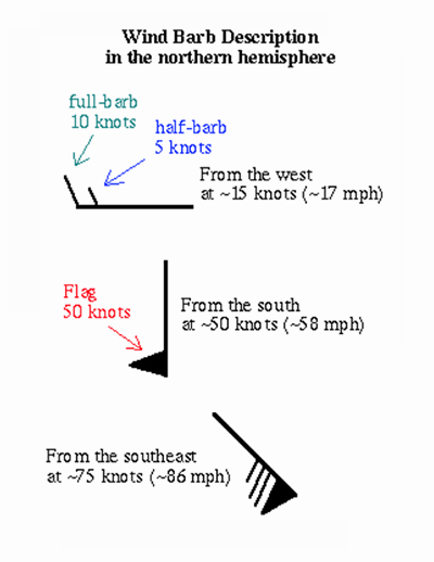
WeatherTAP's model data displays the wind as a wind barb. An example of a wind barb is shown below. The flag represents winds in knots, which are really close to mph. One knot is 1.15 mph. If you want to keep it simple, just remember the flag represents winds of nearly 60 mph, while the long bar is ~10 mph and the short is ~5 mph. The barb always points in the direction the wind is coming from.
We'll discuss more of the wind products when we get to our "jet stream analysis" products.
The next product offered by weatherTAP model data is snow depth. This comes in quite handy in the winter time! This product is only offered by the NAM and the RAP and is not available with the GFS data.
Each model has a different temporal resolution for the snowfall prediction. The RAP model forecasts in one-hour increments, up to 21 hours out in time. The NAM forecasts in three-hour increments, up to 84 hours out. Just keep in mind that each model is forecasting in those increments and not for a specific hour. For instance, if I look at the RAP model for 2:00 pm and it shows 1 inch of snow, that means the model is forecasting one inch of snow to fall sometime between 1:00 and 2:00 pm.
As with any model data, make sure you know when the model was run, as well as for what time the model is forecasting for. Both of these can be found in the lower left hand corner of the screen. The run time tells you what time the model was initialized (or started). You may need to refresh the page to ensure you're getting the most updated model run. The valid time is what time the model is forecasting for.
The RAP conducts a model run every hour. Remember, this is the RAPid refresh model. The NAM model conducts a new model run every six hours. There is a tab under the heading "Model Runs" that lets you select which model run you're looking at. This can be handy if you want to see what model run-to-run consistency looks like. If, for example, the three consecutive model runs of the RAP model predicts 5 inches of snow for you, you can have a higher confidence in that forecast. On the other hand, if the last three consecutive model runs forecast 2 inches during one run, 10 inches in another, and 5 inches during another, you're confidence in that model is low. Model consistency is key to a high confident forecast!
Each model has its own scale, as well, which can be found in the lower right hand portion of the screen. Always make sure you understand the scale, so that you understand how much snow is being forecast. Both scales are in inches.
I hope this helps you understand the snow depth product in our model data! If you have any questions just let me know! (askus@weathertap.com).
The next topic we will address takes us back to the importance of moisture in the atmosphere. Keep in mind, moisture is the fuel for storms. The more moisture that is available in the atmosphere, the more fuel that is available for the storms to build and intensify.
Knowing how much moisture is in the air is key to knowing how strong storms could potentially become.
Dewpoint is one of the best measures of moisture we have. Therefore, it is absolutely vital that we know what that dewpoint temperature is throughout the atmosphere. The dewpoint is the temperature to which the air must be cooled to in order to reach saturation. In other words, dewpoint is the temperature that must be reached in order for the relative humidity to be 100% (fully saturated air).
Every air mass has a certain temperature at which saturation will occur. Saturation is ALWAYS reached by cooling the air. You NEVER warm the air to its dewpoint, you always cool the air to its dewpoint. This is one of the very rare times when we can say the words "always" and "never" in meteorology. A desert airmass may have a temperature of 90 degrees and a dewpoint of 20 degrees. While a coastal location, such as New Orleans, may have an air temperature of 90 degrees and a dewpoint of 80 degrees.
So, what does that mean?
If the air temperature is 90 degrees and the dewpoint is 20 degrees, then we know that the air can only be completely saturated at 20 degrees. Since we are 70 degrees away from that saturation temperature, we can say the air is very dry. That's what you expect in the desert, right?
On the other hand, if New Orleans has an air temp of 90 and a dewpoint of 80, we would know we are only 10 degrees away from saturation and the air is very humid. That's what we might expect in a coastal city like New Orleans, right? Generally, as long as the air temperature is within 10 degrees of the dewpoint, we can say that the air is moist enough for precipitation. Again, the closer the air temperature is to the dewpoint, the more moist the air is. If your air temperature and dewpoint are both 70 degrees, the relative humidity is 100% and the air is fully saturated and it is raining outside.
Since you know that the air temperature will never go below the dewpoint, you can use the dewpoint as a rough guide for how cold your overnight low will be. If the dewpoint is 40 and the afternoon high was 60, you know that your overnight low can't go below 40 degrees. You would only be able to go below 40 degrees that night if your dewpoint dropped further.
It is worth noting that the air temperature is much more easily changed than the dewpoint. You'll see only small changes with dewpoints over time (usually), but the air temperature can change much more dramatically in a short period of time.
I hope this helps you understand dewpoint and that this will help you when using our model data's forecast dewpoint temperatures!
The next product offered in the weatherTAP model data is the tropopause pressure data. The pressure at the tropopause can give us important information about the temperature profile of the atmosphere.
First of all, the tropopause is the highest limit of the atmosphere that we expect weather to occur in. The height of the tropopause varies from about 11 miles up at the equator, to only 5.5 miles up at the poles. Understanding why there is such a height variation between the equator and the poles with the tropopause is key to understanding why we are concerned with it.
As the atmosphere warms during the day, it expands. As it cools at night, the atmosphere contracts. Warm air heats the atmosphere and expands it, pushing the tropopause up higher into the atmosphere. This is why the tropopause is so much higher up at the equator. There is so much heat pushing it upward; a consequence of a warming and expanding atmosphere.
At the poles, the earth is very cold and there is not much heat to expand the atmosphere or push the tropopause level upward. Therefore, the tropopause height is only about 5.5 miles up.
Incidentally, climate change studies focus on the tropopause to study atmospheric warming. If the climate is warming due to the Greenhouse Effect, we should first see the warming in the atmosphere, where the gases responsible for this effect reside. If the atmosphere warms, then the tropopause level would rise, and that's exactly what atmospheric scientists are interested in studying.
Pressure decreases as you go up into the atmosphere. Therefore, the higher the tropopause level is, the lower its pressure will be. Consequently, the higher up into the atmosphere the tropopause level is, the warmer your surface temps will generally be. Keep in mind, the warmer surface temperatures are probably what caused the atmosphere to heat and expand in the first place.
Identifying areas of lower or higher tropopause pressures can give us a better understanding of how the weather at the surface is affecting the atmosphere. This all goes back to the philosophy in meteorology that in order to understand the weather, you must understand what is taking place at each level of the atmosphere from the surface to the tropopause.
(under the Aviation Tab)
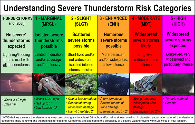
The next tab we move to is the aviation tab. Within this tab you will find the option for severe weather outlooks. You may be wondering what the different levels of advisory are all about. Well, this should help you out!
First of all, convective outlooks are issued by the Storm Prediction Center (SPC), which is located in Norman, Oklahoma on the campus of the University of Oklahoma. In addition, all severe thunderstorm and tornado watches (watch=conditions are favorable) are issued from the SPC. Every single one of them. Warnings (warning=severe wx is occurring) are then issued by your local National Weather Service (NWS) office.
Level 0
The lowest level of threat is the general thunderstorm category. This is an area highlighted in light green that just shows that non-severe thunderstorms are possible.
Level 1
If conditions look favorable for a couple of storms to reach severe limits, an area for the Marginal Risk of severe weather will be issued. The Marginal Risk is highlighted in a darker shade of green.
Level 2
We get more concerned when a Slight Risk of severe weather is issued. This is an area that the SPC will highlight in yellow. Isolated severe storms are expected in a slight risk area, so everyone must pay attention to the weather when Slight Risk areas are highlighted.
Level 3
We get even more concerned when an Enhanced Risk area is highlighted. This means that severe storms are likely, with slightly better coverage and/or intensity than we would expect in a Slight Risk area.
Level 4
A Moderate Risk for severe storms really gets our attention. For many of us, this is the highest threat level for severe weather that our area will be issued in a severe wx season. Widespread severe weather is likely in a Moderate Risk and some of those storms are expected to be significant. Tornado outbreaks and/or widespread damaging wind events often take place in Moderate Risk environments. Most people in this threat level will be impacted in some way by severe weather.
Level 5
In very rare instances a High Risk will be issued. This is the most concerning risk category of all. Widespread, destructive severe weather is likely within a High Risk area. Severe storms, some of which could be exceptionally strong, are possible. It is within these risk areas that folks see violent tornadoes (EF-4/EF-5) and/or significant, widespread, damaging winds.
That's generally the convective outlooks in a nutshell. Can there be a significant tornado in a slight risk area? Of course. Has there ever been a high risk area outlined and severe weather did not occur? Of course. But, most of the time the outlooks verify and severe weather occurs the way we generally expect it to.
Always be mindful of your threat level. The SPC updates these convective outlooks throughout the day. Knowing your risk can help you better prepare for the severe weather that may threaten your area.
As of now, these particular convective outlooks are only issued for Days 1-3. If warranted, each day will feature areas outlined for thunderstorm risks. A separate set of convective outlooks are issued for days 4-8, outlining possible threat areas in the coming week. Forecast accuracy for the 4-8 day outlook is low, but sometimes the signals are so strong and consistent that the SPC feels they can begin advising folks of the risk of severe weather.
Here's a handy chart describing convective outlooks, created by the SPC. Again, this particular set of threats are only highlighted on the days 1-3 outlook and not on the 4-8 day outlook.
(under the Aviation Tab)
Knowing where the jet stream winds are strongest, as well as how they are behaving, is key to any good forecast. The weather begins up high above our heads. What happens up there eventually influences what happens down here at the surface.
The atmosphere behaves like a fluid, so we often describe things in the atmosphere as we would a fluid. This is one reason why we often describe the jetstream as a river of air. It rarely flows in a straight line and often meanders, just as a river would do. The meanders tell us what to expect here at the surface (more on that in the next lesson).
The jet stream flows at an altitude of about 30,000 feet. It can easily contain winds that exceed 100 mph. So how does the jet stream influence our weather? I'm glad you asked!
Remember, the atmosphere is in layers as you go up. Each level influences the other in some way. When the winds at 30,000 feet increase, the air at another layer must rise to replace the air that is being carried away. Rising air cools and condenses, forming clouds. The farther down in layers that rising air can come from, the more those clouds can grow, possibly leading to intense precipitation and/or storms. That brings me to another point.
You may have heard the term "surface-based instability". This is exactly what that is referring to. If warm, moist air here the surface is lifted upward by a powerful jet stream, thunderstorms can result. Since warm, moist air is fuel to a storm, the more warm and moist our surface air mass is determines how big storms can get (generally). Air that is rising from the surface can also lead to tornadoes. A tornado is basically an updraft that can draw air from the surface. If it cannot draw air from the surface, it cannot reach the ground and cause damage.
When you use the jet stream analysis tool on weatherTAP, you can see the path the jet stream is taking. Like a river, the middle of the jetstream is fastest, with slower winds on the sides. Embedded within the jetstream's winds are areas of faster winds known as jet streaks. These are areas where the faster winds of the jetstream will cause localized areas to have air that is rising even faster, leading to precipitation or even storms. A typical jet streak may influence an area the size of the state of Tennessee. In areas with no coloration, that just means the winds are below 60 knots.
When you hear us forecasters say "there's a disturbance coming" we are often referring to a jetstreak that is on the way. We have to keep an eye on these jetstreaks because they can bring sudden changes in the weather.
In our next lesson I'll talk about how the bends in a meandering jet stream influence the weather. I'll also explain more about what I mean when I say the weather up there (in the atmosphere), determines what happens down here (at the surface).
(continued)
The jet stream behaves like a river of air at around 30,000 feet above the surface of the earth. It crosses the earth and can generally be found high above a conflict between cold air and warm air at the surface. Cold air is often found to the north of the jetstream, while warm air is found south of the jetstream.
Like all wind, the wind of the jet stream is the result of pressure imbalances. The higher pressure of cold air and the lower pressure of warm air creates wind. Wind is Nature's way of trying to smooth out the pressure difference. The winds of the jetstream are a result of pressure/temperature imbalances between warm and cold air.
Temperature and pressure share a very close relationship with each other. Cold air is heavy and sinks, pushing down on surface objects and creating high pressure. Warm air is light and easily rises. This means that warm air is not pushing down on surface objects, creating low pressure.
In the winter time, the jetstream dips into the U.S. and brings changeable weather. If you find yourself south of the jetstream you have warmer weather. If you are north of the jetstream you have colder weather. In the summertime, the jetstream retreats to the north and has little influence on weather in the U.S. The U.S. is dominated by warm air in the summer and we don't see the conflict between warm and cold air. Therefore, the jetstream products are often most valuable to those of us in the U.S. during the winter time.
There are different aspects of the jetstream that are very important to us. Keep in mind, the jetstream is normally found at around 60 north latitude, which is right through the middle of Canada. During the winter, it sinks a bit farther south. During the summer, the jet stream moves farther north. As the winds of the jetstream circle the globe, they encounter obstacles that cause the jetstream to become wavy. One such obstacle that causes it to become wavy is the Rocky Mountains.
As the winds of the jetstream come across the Pacific Ocean, they are able to accelerate, since there are no obstacles across the ocean. As the jetstream comes into contact with the Rocky Mountains, it is forced to decelerate. This causes the jetstream to buckle and become very wavy. The speed at which those winds hit this obstacle determines how much of a wave the jetstream develops. Note: even though the jetstream winds are so high up, they are affected by the drag of the surface winds below them that are making contact with huge obstacles like the Rockies.
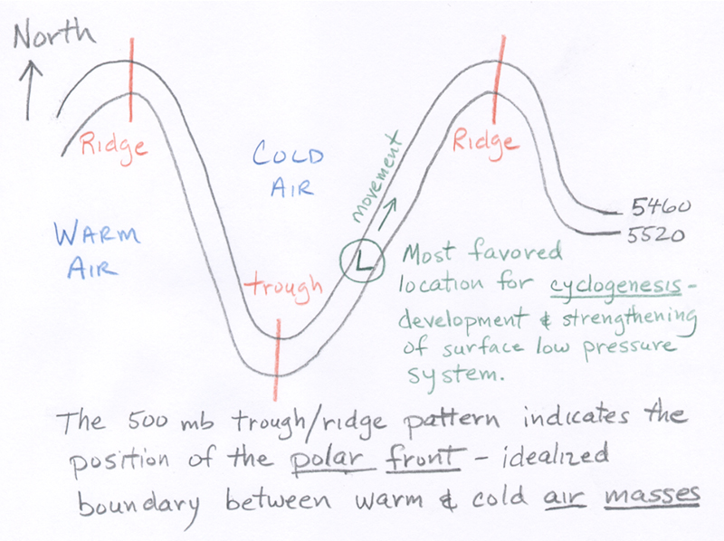
This is the cool part! The jetstream often hits the Rockies with similar intensity and in a similar location. Because mid-latitude cyclones (storm systems) like to form at the base of the bends in the jetstream, we can say with a fair amount of certainty where the next storm system will develop. In the U.S. that favored region for such cyclogenesis is southeast Colorado.
The image below shows favored area of cyclogenesis, with the one area in southeast Colorado being from the bending of the jetstream as it interacts with the Rocky Mountains.
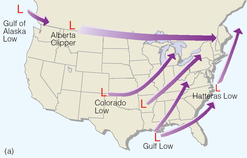
And this diagram, found at www.atmo.arizona.edu, shows how this all comes together.
So, understanding what the jet stream is doing is vital to a good forecast. The faster the winds of the jetstream, the stronger the cyclogenesis may be, which affects all of us in the central and eastern U.S. Stronger storm systems can bring severe weather, blizzards, flooding, and a variety of weather across the U.S.
So, while the jetstream is high above us it certainly affects what happens here at the surface.
I hope this expands your understanding of the jetstream. We'll learn even more about this incredible feature in part 3, which will be available next time!
Wind barbs provide very useful information, but they can be a challenge to read. By keeping just a few things in mind, they can be less complicated!
For starters, here is an example of a wind barb:
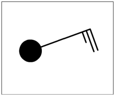
The solid dot represents the station location. The amount of darkness inside the dot represents the amount of cloud cover there is. In this example, skies would be mostly cloudy.
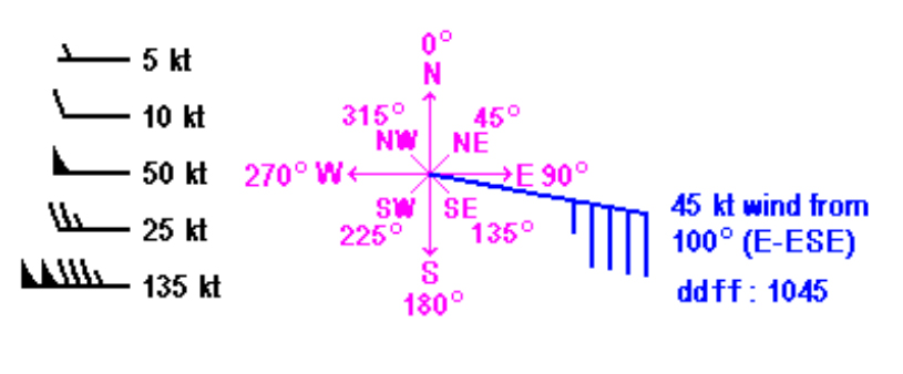
First of all, the direction the barb is pointing is the direction from which the wind is coming. In this example, the wind is coming from the northeast, because the barb is pointing toward the northeast.
When looking at a wind barb, unless otherwise stated, east is to your right and north is on top of the page.
Next, the speed of the wind is determined by the marks at the end of the barb.
One short barb = 5 knots = ~6 mph
One long barb = 10 knots = ~12 mph
(One knot equals 1.2 mph)
So, in the wind barb example above, the wind speed would be 25 knots (~29 mph) from the northeast.
Now, if the winds are really strong, we give them another symbol that will replace the barbs at the end of the wind barb. If winds exceed 50 knots, or 58 mph, we use a flag to represent 50 knots.
An example of all the categories of barbs, as well as the flag, are seen below:
I hope this helps! If you have any questions please let me know!